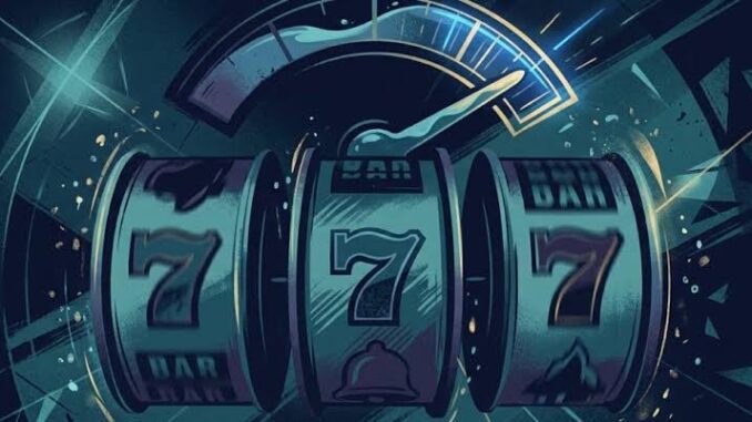
The lever is probably the best-known part of an old slot machine, even among people who have never pulled one. It appears in films, on casino signs, and in the familiar phrase “one-armed bandit.” On a phone, its replacement is usually a circle with an arrow inside.
Replacing the lever was fairly straightforward. Finding room for everything else was harder. A slot cabinet could spread its controls across a panel. A phone has to put them on the same small screen as the game, where a finger can hide the very thing someone is trying to press. That changed some fairly ordinary parts of slot design, from where the bet amount appears to how long a winning combination stays visible.
From Casino Cabinets to Something You Can Hold
Look at a traditional slot cabinet, and there is often unused space around the controls. Buttons can sit apart from one another. Prize information has somewhere to go. The player’s hand doesn’t cover the reels.
Desktop games carried some of that arrangement onto a monitor. They could put a row of buttons underneath the reels and leave it there throughout play. Small icons weren’t much of a problem when a mouse pointer could pick them out.
Those same icons became troublesome on phones. A fingertip takes up considerably more room than a cursor, and a label that looks perfectly readable on a computer can become tiny when the whole game is reduced.
Making the buttons larger only solves part of it. They then take space away from the reels, the balance, or something else that also needs to be visible. Mobile layouts have to make room by moving controls, combining them, or putting the less-used options behind a menu.
A Spin Button Has to Be Hard to Miss
The spin button gets a generous share of that space. It is the control players return to most often, so making it easy to find saves them from having to search the screen between rounds.
The bet controls need a little more thought. They should be accessible, but placing them too close to the spin button can cause problems. A small adjustment to a thumb’s position shouldn’t turn an intended spin into a change of stake.
Someone using Pokie Machine to find where to play online pokies for real money may be looking mainly at the available games. Once a game opens, though, the layout becomes more relevant. The current stake should be easy to read, and the steps for changing it should be clear before any money is wagered.
There is no physical boundary between these controls on a phone. Their size, position, and labels have to do the work that separate buttons once did.
Why Portrait Mode Changed the Layout
Most people pick up a phone without turning it sideways. For a game built around five reels arranged across the screen, that leaves an awkwardly narrow area to work with.
Simply squeezing the reels together can make the symbols difficult to distinguish. Keeping them large leaves less room elsewhere. A balance bar, a menu button and a few betting controls can soon fill what looked like a reasonably spacious display.
Some games rearrange themselves when the phone turns. The controls move below the reels in portrait mode, then return to the side in landscape. Others work in one orientation because that suits their particular reel arrangement.
There are limits to how much rearranging helps. A game with several separate reel sets may need the width of a landscape screen. A simpler slot has fewer demands and may fit comfortably upright.
Players notice the result in small ways. They can read a prize without tilting the phone, for example, or reach the spin button without shifting their grip.
The Little Details Your Fingers Notice
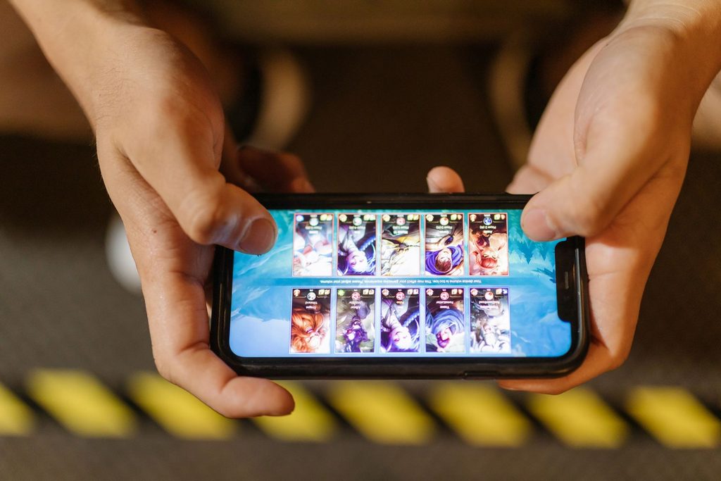
A screenshot won’t reveal every problem with a mobile game. It can show a tidy layout with clearly separated controls, yet say very little about what happens when someone actually holds the phone.
A button in the upper corner might require a stretch. Another might sit exactly where the player’s palm touches the edge of the display. Someone using both hands may have no trouble with either, while a person playing with one thumb keeps adjusting their grip.
Even the visible size of an icon can be misleading. The area that accepts a tap may extend beyond its outline. That gives a finger some room for error without requiring an oversized symbol on the screen.
Apple’s interface guidelines recommend a minimum touch target of 44 by 44 points for common interactive elements. The distinction between the icon and its touch target matters here. A small settings symbol can still be reasonably easy to press if the surrounding area responds too. Provided, of course, that another control hasn’t been placed right beside it.
Animations Had to Adapt Too
During an ordinary spin, the reels may be the only thing requiring much attention. A bonus round can be busier. Winning symbols light up, multipliers change, and a total starts counting upwards, sometimes while a character moves across the background.
A large display gives those elements room. On a phone, a player can miss one while watching another. Showing the results in sequence helps, the game might highlight a combination, apply its multiplier, and then display the resulting win. There’s less for the player to follow at once, although each extra pause adds time to the round.
That creates another design problem. A lengthy animation may be enjoyable the first time a feature lands and tiresome after repeated appearances. Speed it up too much, and the amounts become difficult to follow.
Graphics also have to run on the device in someone’s hand. Detailed effects take processing power, and phones vary considerably. Delayed responses and stuttering reels are particularly noticeable in a game where the player expects something to happen as soon as they tap.
What a Touchscreen Still Can’t Replace
A physical button moves when pressed. Even before the reels start, the player has felt a response. With glass, that confirmation has to come from somewhere else. A spin button might briefly darken or appear to sink into the screen. A sound can acknowledge the tap. Some games use a short vibration.
Without a clear response, there can be an uncertain moment between touching the button and seeing the game react. The player may tap again, wondering whether the first attempt registered.
That is a small problem to describe, but an irritating one to encounter repeatedly. For all the attention given to graphics and bonus features, a mobile slot still needs to get that ordinary exchange right. A finger touches the screen. The game responds.
Leave a Reply